
HOW TO MIX PRINTS AND PATTERNS IN YOUR HOME
Do you love patterned fabrics but not sure how to use them in your home? With so many styles, motifs and product types, it can be a bit of a minefield, so I've put together some tips to help you when choosing and combining prints and patterns.
How do I know this, you may be wondering. After studying a Textiles degree at university, I went on to open my own print design company, selling artwork, tea towels and accessories, creating complementary designs that were easy to pair together. I completed an Interior Design Diploma last year, and then took on a renovation project, where I will be incorporating my love of pattern and colour into our new home.
Here are three tips to help you add more pattern to your decor if you're not sure where to begin:
1. START SIMPLE
If you're unsure where to start, go for something small and simple. Add a striped lampshade, a floral cushion or a geometric patterned vase. These are relatively inexpensive items so you can start to get a feel for what you like, before exploring more permanent and expensive items like upholstery and wallpaper.
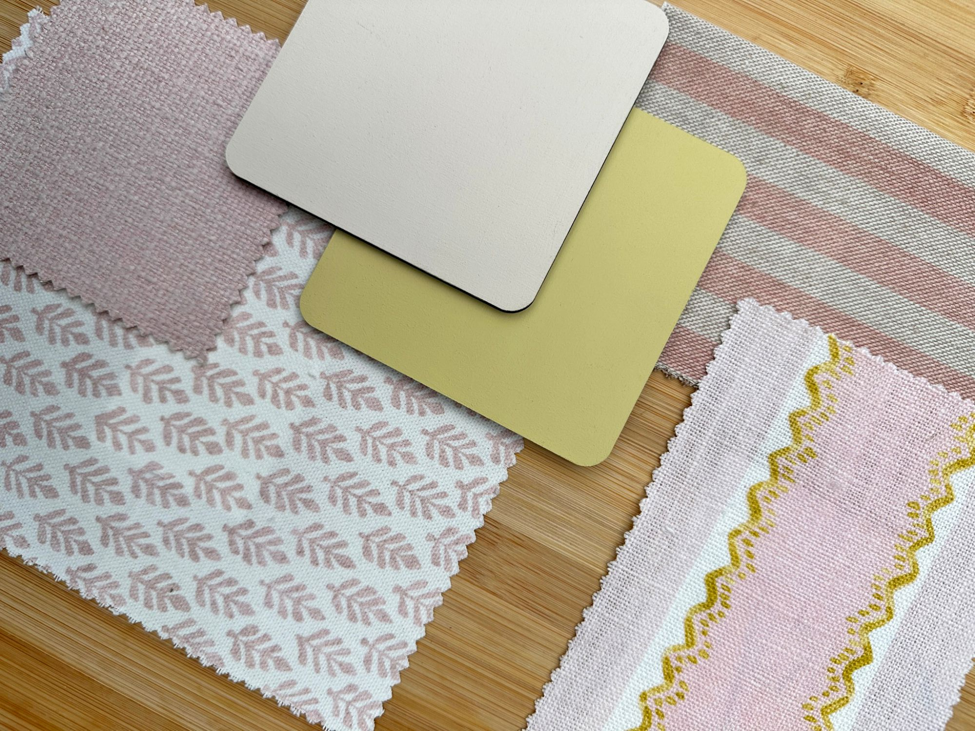
2. STICK TO A COLOUR PALETTE
If you already have a finished or semi finished room and are wanting to add some pattern, choose a design with colours that you already have in the room. You can vary the shades but make sure the colours are a similar tone. As an example, if you have a sage green room with a beige sofa, you could add a pink, green and cream floral cushion. If you have a navy sofa, beige carpet and cream curtains, you could add a cream and burnt orange geometric cushion. You're adding another colour here, but you have linked the cream from the curtains, and blues and oranges sit well together. As a general rule, stick between 3-5 colours to keep it looking cohesive.
3. COLLECTIONS
A lot of brands design their fabrics/wallpapers in collections, meaning they will stick to a colour palette and theme. You'll be able to see similarities across the designs as they have been designed to use together. Linwood, iLiv and the Sanderson brands are particularly good at this, and you can see the collections online in real spaces to envision how they will look. Even if you want to use something from a different brand, these collections should give you inspiration as to what other motifs and colours to look for.

SOURCES: Sofa - Laura Ashley // Cushions - Birdie Fortescue, Linwood // Lamp & Light - Pooky // Sideboard - Perch & Parrow // Artwork - Abstract House // Vase - Henry Holland // Table - Shropshire Design
I hope these tips help you when choosing patterns to add to your home, but if you need a little more help, I offer a package to create a colour and fabrics scheme for your next project. Click here to see how I can help bring your next room to life!
If you love print and pattern, why not join The Pattern Pantry, a Facebook community for print and pattern lovers! I set up the group to help give you the confidence to add more print, pattern and personality to your home. I share tips, industry news and inspiration to give you the ingredients for a cohesive, pattern filled home.
Ready to join? It's free! Just head over to Facebook using the link below and join us. See you there!

Comments